

Why Does Music Trigger Emotions?
Believe it or not, color plays a huge role when it comes to visual communication. Colors have a huge effect on our emotions, moods, and of course, our behavior. Color theory helps you understand the relationships between colors and how to use them in your project.
In this article, we will explain the basics of color theory and how you can apply it to your projects. If you find this article interesting, we invite you to browse our blog for more!
What is Color Theory and How Does it Help You Enhance Your Creations?
Color theory is an essential part of any creative process. Think for example about the color red, what comes to mind when you think about it? You can think of feelings like anger, passion, or visions of blood, a heart, a stop sign. This happens because you associated the color with certain emotions, ideas, and objects. Don’t worry, this is pretty normal, and it happens to everyone; you should keep this in mind next time you are editing your video, for example.
Color theory can help you create effective color combinations, understand the different hues and shades, and see how geometric relationships are represented on the color wheel. With a better understanding of color theory, you'll be able to take your creations to a whole new level.
Behind the color theory, there’s the Color Wheel, which was created by Sir Isaac Newton in the late 17th century. The color wheel is widely used nowadays for understanding which color combinations work and which not. Understanding the color wheel will help you enhance your creations and communicate your vision in a better way.
Using the Color Wheel to Understand Combinations & Contrasts in Your Projects

The Color Wheel is a powerful tool for designers and any other person to understand the relationships between colors and create appealing visual projects. It helps us to identify complementary, analogous, and triadic combinations of colors that can be used together to create visually striking and balanced designs. With a better understanding of the visual representation of colors, we can use the Color Wheel to mix and match different shades of colors in our projects. Additionally, understanding the contrast between different hues will help us create more eye-catching designs with greater impact.
The Color Wheel consists of three primary colors, which are red, yellow, and blue. Then you have three secondary colors, these are created when primary colors are mixed, so green, orange, and purple. And lastly, six tertiary colors, which are made from primary and secondary colors, such as blue-green or red-violet.
If you draw a line through the center of the circle, you’ll get warm colors such as red, oranges and yellows, and cool colors like blues, greens and purples.
Exploring the Psychology of Colors & How They Affect Your Audience
The psychology behind colors is fascinating. And we’re surrounded by them. Huge brands have been known to use this psychology of colors, so do films (cinematic lights), photography, and marketing. When choosing colors, we usually think about how things will look, which of course, it’s important. But it’s also fundamental to think about how they feel, because color has such a powerful impact on the human brain. Each color represent different things and emotions. Remember the exercise we did earlier with the color red? Well, each color also has its own meaning.
Here are a few general feelings that each color evoke:
Red
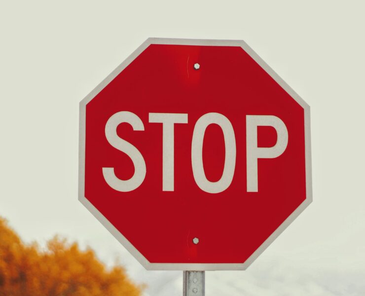
Red evokes a feeling of danger, passion, urgency, and love. Red is associated with energy, looking at it can increase a person’s pulse, heart rate, and metabolism. Crazy, huh? It’s also super eye catching (that’s why lots of road signs are red), so you can use it to grab the attention of the viewer.
Orange
Orange is associated with optimism, fun, and a positive energetic vibe. For some reason, it’s also associated with inexpensive products, so it can help you highlight your prices.
Yellow
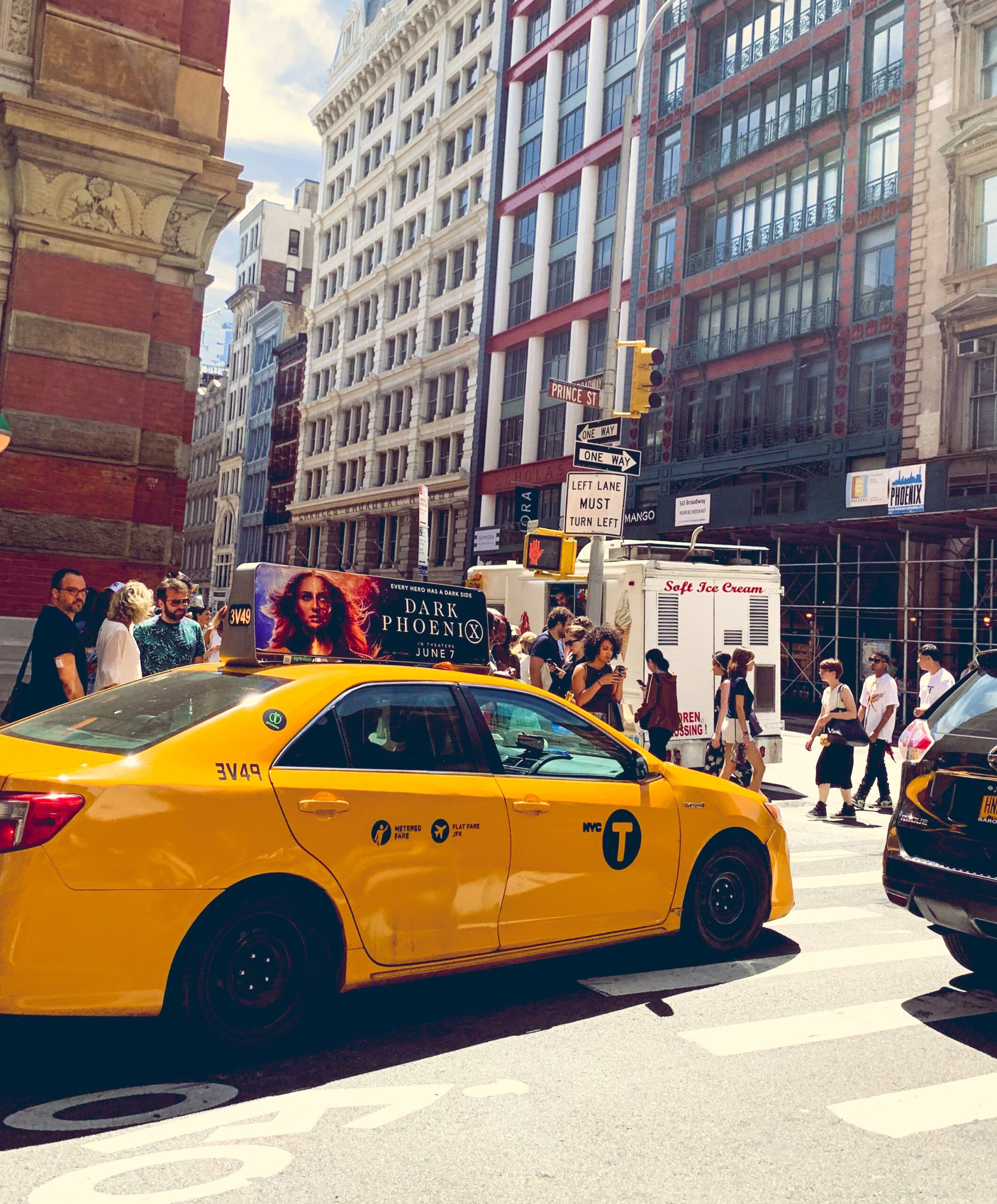
Yellow is all about happiness, fun, young, warmth, and attention. If you think of it, you’ll also probably think about the sun. There’s something sunny about it. Foremost, yellow, it’s an attention grabber. When combined with black, it can quickly grab our attention. You can think of scholar buses, or NYC taxi cabs.
Green
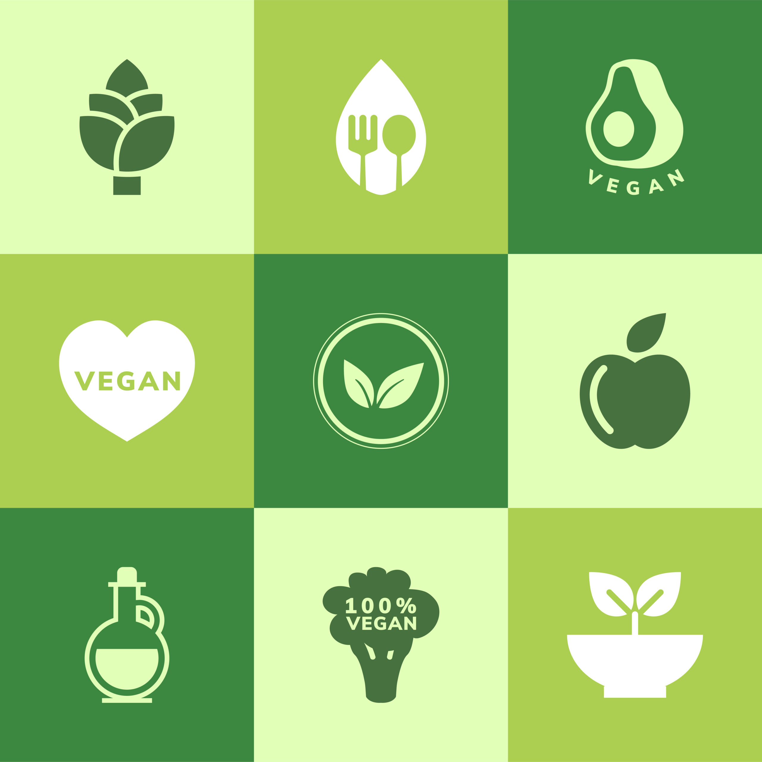
The color green can be associated with growth, success, nature. Think about products related to nature, they are usually green. That’s because green is also associated with health, freshness, and other natural qualities. For example, green is an amazing choice color for vegan products.
Blue

Blue is all about trust, reliability, comfort, intuition, and calmness. This color is widely used by brands because it gives a sense of security (think of American Express). It’s also a color of relaxation and comfort. In films, blue is used to represent melancholia (think about Sadness in film Inside Out), calmness, water, spirituality, and loyalty.
Purple
This color can be associated with luxury, creativity, and wisdom. It has been linked to royalty and expensive products. In films, it represents the fantasy, the mystery, the ethereal and the eroticism.
Black
![]()
Black is a color of power, of sophistication and mystery. Luxury sites make good use of this color, although other brands just limit their use to text. When it comes to film, we can think of black representing grief and fear.
White

The color white is all about cleanliness, purity, peace, health, innocence. This is a color you can easily relate to health and cleanliness, that’s why it’s chosen by many medical and cleanliness products. It’s also a color of isolation and coldness, which can be greatly used in film.
We hope you have enjoyed this article about the color theory and the meaning behind every color out there. Make sure that you make good use of this information and get in there, start playing with colors, and take your content to the next level!

